Post by @jorijn
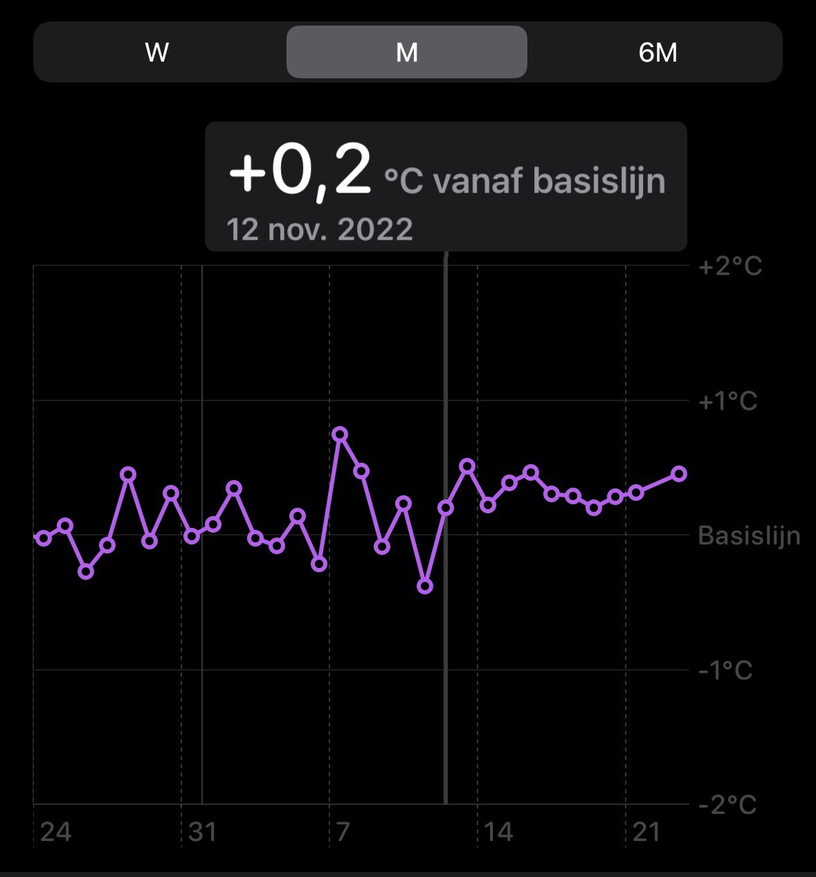
I had some surgery to get my knee fixed on 11th of November. Very cool to see this data of my temperature trending above its baseline, indicating my body is working hard to repair itself. Measuring points are taken each morning when I wake up with an Apple Watch.